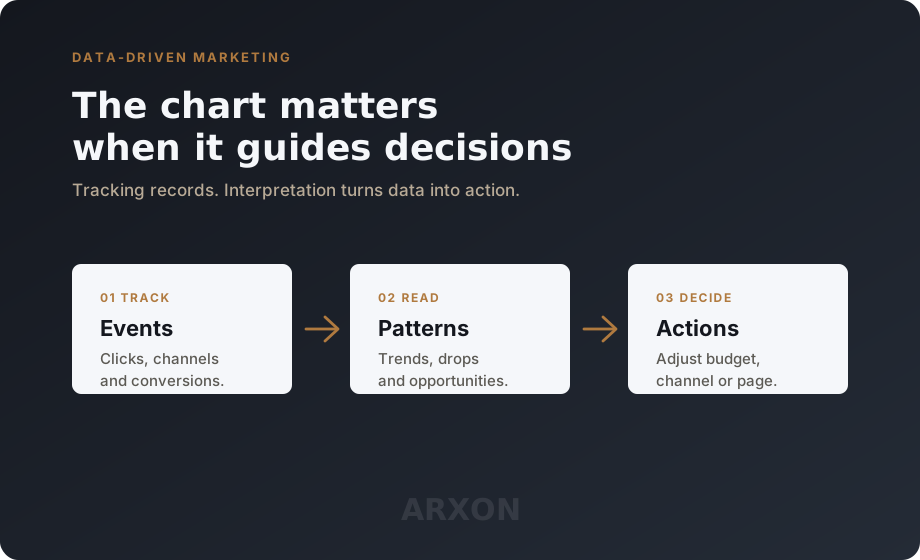
Tracking the website is the first step. But there is an important difference between having data and understanding data.
Many companies install analytics tools, monitor colorful charts and receive automatic reports, but still do not know what to do with the information. The dashboard exists, the numbers appear, the reports arrive by email. Even so, decisions remain based on feeling.
That is where proper chart reading comes in.
A chart does not exist only to show numbers. It helps reveal behavior, trends, performance and opportunity. When interpreted well, it shows where marketing is working, where budget is being wasted and where there is room to improve.
Metric, indicator and KPI are not the same thing
Some technical terms make charts easier to read. The first step is separating metric, indicator and KPI.
A metric is any quantitative data tracked in marketing. It can be visits, clicks, conversions, cost, revenue, bounce rate or time on page. The metric shows how much something happened.
An indicator is a metric used to guide a decision. Not every metric is an indicator. The number of likes, for example, may be a metric. It only becomes an indicator if it helps evaluate a real campaign objective.
KPI stands for Key Performance Indicator. It is the most important indicator for measuring whether a strategy is reaching its objective. If the objective is sales, the KPI may be revenue or qualified conversions. If the objective is contacts, the KPI may be leads received.
This difference matters because a dashboard full of metrics may look complete and still fail to answer any management question. A good dashboard does not show everything. It shows what helps the team decide.
Conversion is where marketing meets the operation
Conversion is the desired action the user performs on the website. It may be filling out a form, clicking WhatsApp, making a purchase, downloading a material or requesting a quote.
Conversion shows whether the visitor did what the campaign expected. That is why it connects marketing and the operation. It is not enough to know how many people arrived on the website. The company needs to know how many moved toward an action that creates a real opportunity.
Conversion rate shows the percentage of visitors who performed that action. If 1,000 people accessed a page and 50 filled out the form, the conversion rate is 5%. This helps understand whether the site is turning traffic into opportunity.
But the rate alone does not explain everything. One campaign can bring fewer visitors and better leads. Another can bring a lot of traffic and almost no useful conversation. The chart becomes useful when volume, quality and cost are analyzed together.
The funnel shows where the journey breaks
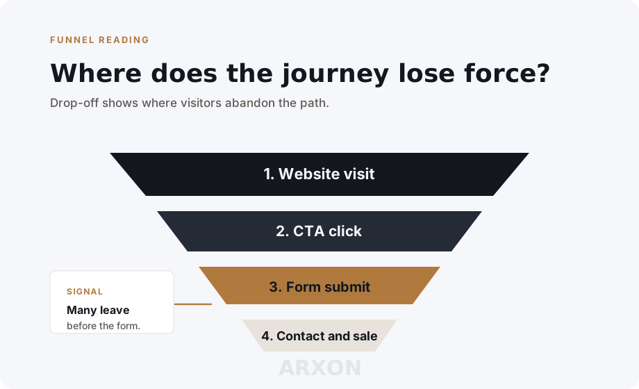
The funnel represents the steps the user follows before becoming a lead or customer. It may start with a website visit, move through a button click, form submission, sales contact and sale.
The funnel helps identify where people are giving up. This abandonment point is called drop-off.
If many people visit the page but few click the contact button, the problem may be the offer, the clarity of the message or the layout. If many people click the button but few submit the form, the form may be too long or may ask for information too early.
Intermediate events also matter. An event is a tracked interaction on the website: button click, form submission, page scroll, video play or WhatsApp click. Events show what happened before the final conversion.
Without events, the company sees only the beginning and the end. With well-configured events, it understands the path.
Channel, source and UTM explain where results come from
Acquisition channel is the visitor's origin. It may be Google, Instagram, Facebook, paid traffic, organic search, email, referral or direct access.
Source and medium are classifications used to identify traffic more precisely. The source may be google or instagram. The medium may be cpc, organic, social or email. This combination makes campaign comparison clearer.
UTMs are parameters added to campaign links to track source, medium, campaign and content. With UTMs, it is possible to know which ad, post, button or email generated access and conversion.
Without this care, the company knows it had visits. With this care, it knows which channels brought good visits, which campaigns brought leads and which messages generated action.
This is where many charts start revealing waste. A channel may bring a lot of traffic and little conversion. Another may bring fewer visits but more qualified leads. The decision should not look only at volume. It should look at quality and return.
CTR, CPC, CPA, ROI and ROAS tell different stories
CTR means Click Through Rate. It measures the percentage of people who clicked an ad or link after seeing it. A high CTR may indicate that the message got attention. A low CTR may indicate that the creative, offer or audience needs adjustment.
CPC means Cost Per Click. It shows how much the company pays, on average, for each click in a paid campaign. It helps evaluate whether traffic is expensive or efficient.
CPA means Cost Per Acquisition. It shows how much it costs to win a conversion, lead or customer. It is one of the most important indicators for understanding whether the campaign is financially viable.
ROI means Return on Investment. It shows how much the company earned in relation to what it invested. ROAS means Return on Ad Spend. It is similar to ROI, but focused specifically on paid media.
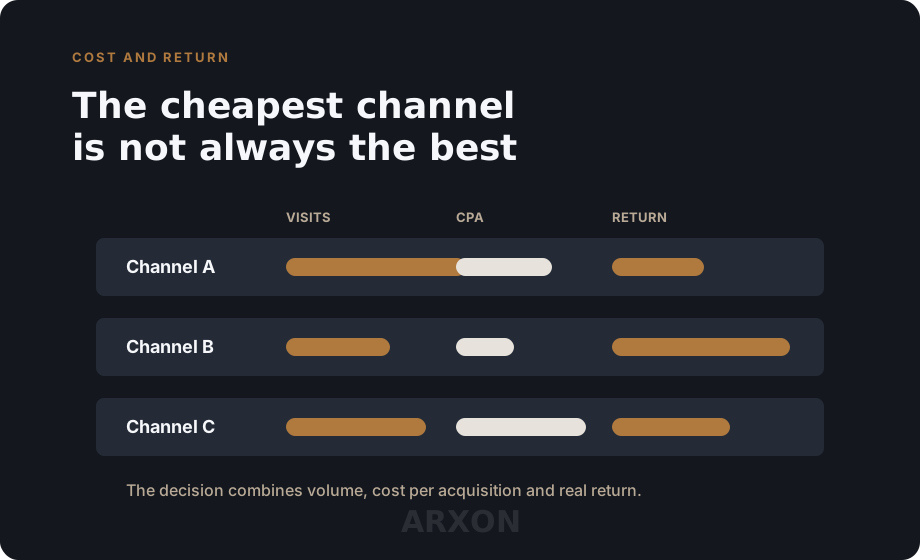
None of these numbers should be read alone. A low CPC may look good, but if CPA is high, cheap clicks are not becoming results. A high CTR may look great, but if conversion is low, the ad promise may not match the page.
Isolated data can mislead
When the company understands these terms, charts stop being illustration and start telling a story.
An increase in visits may look positive, but if conversion rate falls, the traffic may be less qualified. One channel may bring fewer visits but better opportunities. A campaign may have good engagement and still fail to generate business.
Bounce rate indicates the percentage of visitors who enter a page and leave without interacting. A high rate may suggest that the page did not deliver what it promised, loaded slowly or attracted the wrong audience.
Sessions and users also need to be separated. Users are people identified by the analytics tool. Sessions are visits. The same user may generate several sessions. This difference helps understand traffic volume and recurrence.
Engagement shows the level of visitor interaction with the website. It may include time on page, clicks, scrolling, page views and events performed. It helps understand whether the content is being consumed.
Isolated data can mislead. What matters is crossing information: channel with conversion, cost with return, volume with quality, traffic with behavior.
A dashboard should answer questions, not accumulate charts
A dashboard is a panel that brings together the main indicators in charts and tables. But a good dashboard should not show everything. It should show what matters for decision-making.
Before building the panel, the company needs to define which questions it should answer:
- which channels generate real opportunities?
- which campaigns bring traffic but do not convert?
- how much does each lead cost?
- where does the funnel lose strength?
- which actions should receive more budget?
- which pages need adjustment?
In the end, understanding charts means learning to ask better questions. It is not enough to ask "how many people visited?". The team needs to ask "where did they come from?", "what did they do?", "how much did they cost?", "did they convert?" and "what does this behavior reveal about the next decision?".
Data-driven marketing is not only measurement. It is interpretation, comparison and action. That is where tracking stops being a report and becomes management intelligence.
Comments
No comments yet. Start the conversation.